Inspiration, Lifestyle, Nature & the Coast

Colourful Copenhagen

I am just home from a busy and inspirational trip to Denmark.

My sister, Alva is based there at the moment living in a very privileged situation 

– right in the centre of the old part of Copenhagen, Nyhavn2016-08-26 10.23.48
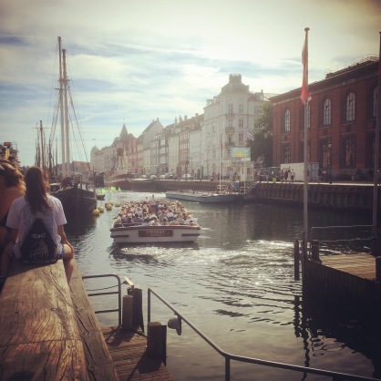
The exterior of the building is a beautiful pink.2016-08-26 18.43.58
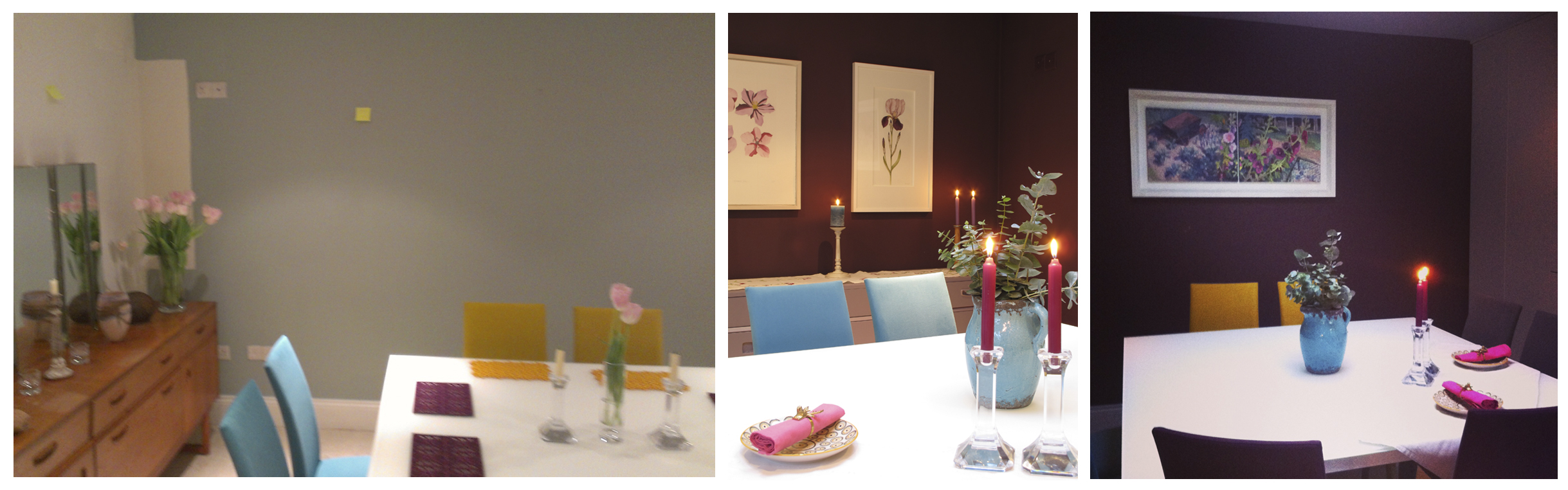
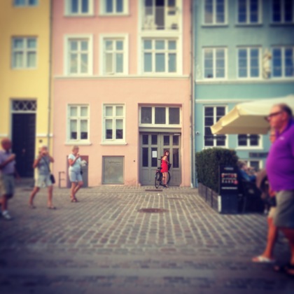
But once you are through the doors it leads to courtyard where the walls are an ochre lime render – a colour I have been researching lately for another project. 2016-08-25 10.24.30

2016-08-24 21.23.10

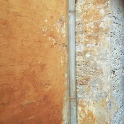
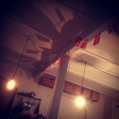
I had the opportunity to meet lots of interesting Danes during the visit. We chatted about the use of the Danish flag in interiors. The Danes see the use of their flag to mean ‘hooray lets party!’ rather than a huge nationalistic pride. You have to admit it is a good looking graphic and makes great bunting.

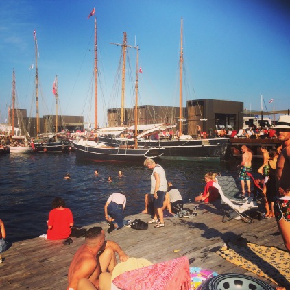
There were swims to be had around the corner at the newly built Ofelia Plads. Lots of people had the same idea…. sandwiches, chilled Rosé, Danish flag napkins and a towel…sorted.

2016-08-26 15.43.21

We visited the Stunning Rosenborg Castle – a 17th Century Palace in Copenhagen built by Christian IV. It was filled with atmosphere, partly thanks to its very clever lighting akin to candlelight. I think they even had ‘Hygge’ in those days, as my friend Helen Russell will tell you

It reminded us both of Ham House in Surrey.

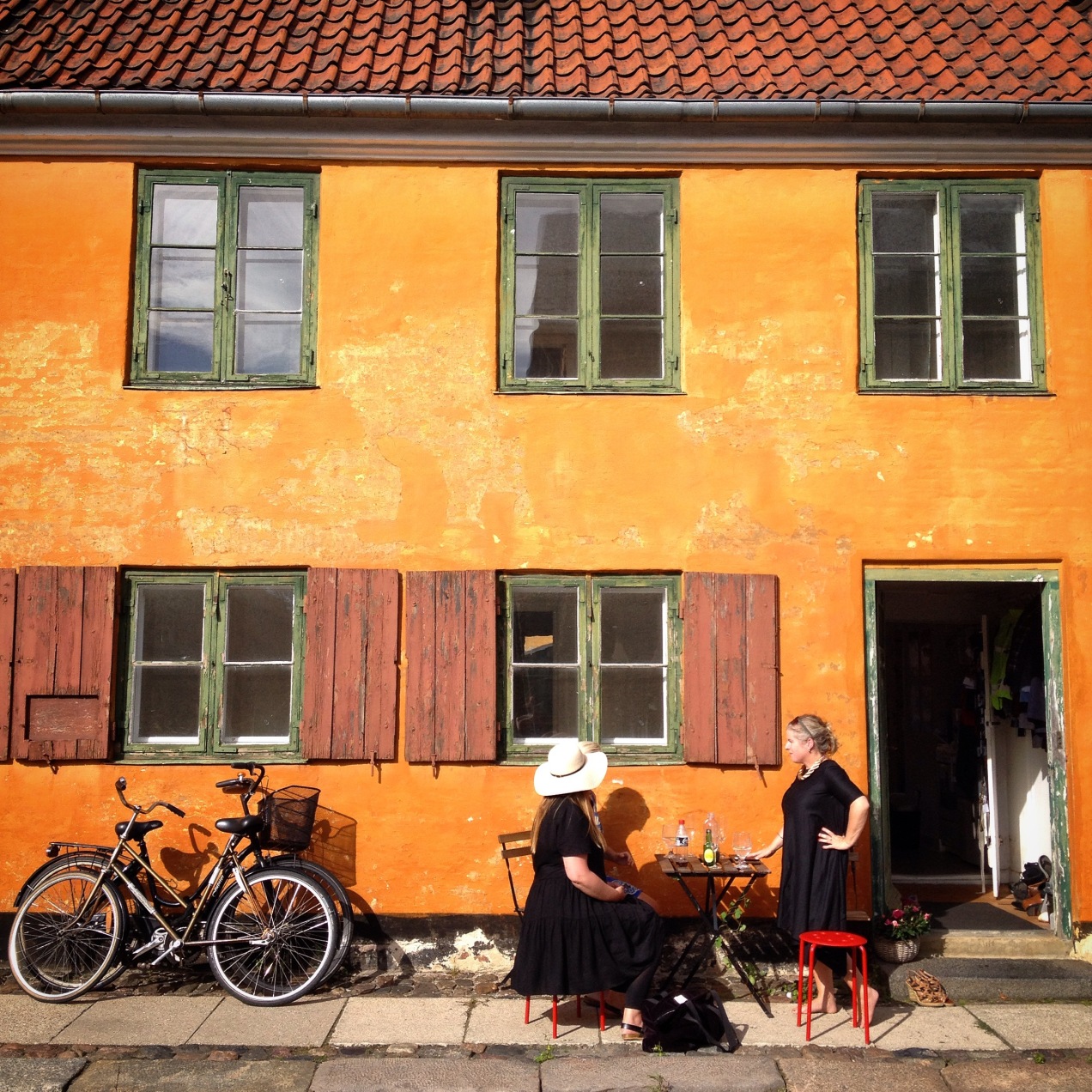
One of the highlights of the trip was a naughty afternoon spent drinking fizz in the sun in one of my favourite places in the world!  Nyboder is a district Copenhagen made up of rows of purpose built Naval Barracks built in the mid 18th century, currently embarking on full and faithful restoration  – as with most old buildings in Denmark. Henriette, our wonderful host explained that the building would have housed the wives and children of the sailors and they very much shared their homes and gardens and supporting eachother for the months while their husbands were at sea.

It is still mostly inhabited by the Danish navy, army and airforce and their is definitely a distinct feeling there. The colour of the render is known as Nyboder yellow. If ever a colour lifted the soul!


On our last day we went sailing in Roskilde Fjord. The reason Alva came to Denmark was to sail on the Sea Stallion, a working replica of a viking longship unearthed in Roskilde, which tests revealed the wood it was built with grew in our own Glendalough in County Wicklow! Read more about Alva’s adventures on the ship here. There is fabulous working museum there – worth a trip.  We went sailing on a replica of a Norwegian fishing boat. It was, shall we say, a very exciting and a bit hairy at times due to unforecast winds that came from nowhere.

Love the colour of the sails  – and the boat was painted white, pink, orange and green.

I have returned home with a heart full of inspiration fueling my love of colour. I met some fantastic people, notedly strong women who work hard and like a good laugh. There was thoughtful design everywhere I looked. Older buildings are cherished and lived in and maintained, therefore are surviving. I am seeing quite a lot of refurbishment on a few of the projects I am working on here in Ireland. I think we are getting better at being faithful to our heritage and being a bit more gutsy in our own use of colour. I would encourage you to consider using it somewhere outside as well as inside. Even on a dull rainy day it can be uplifting!


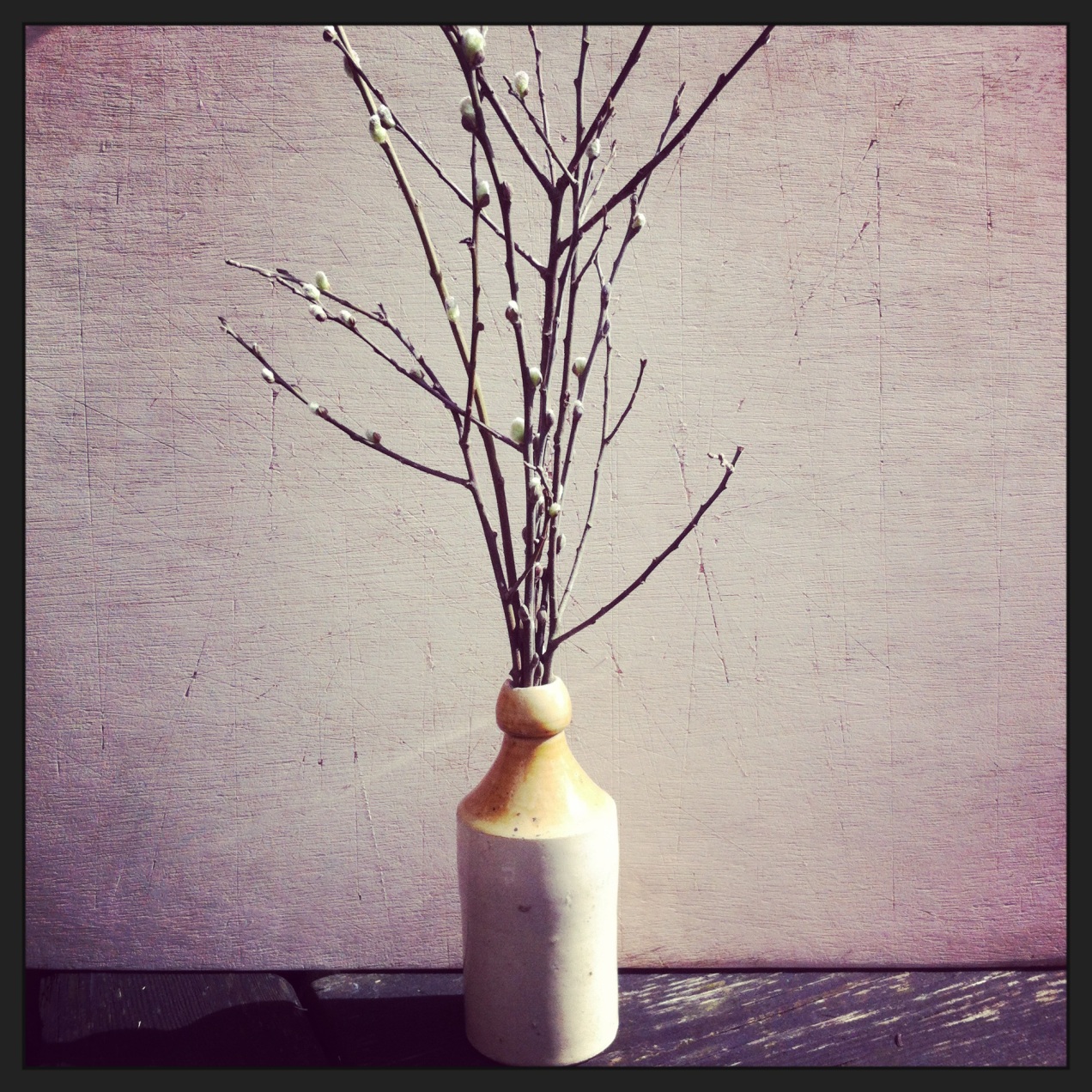
p.s. It is great to come home to this little fellow and race up to the cliffs where it is evident the Season is achanging. I’m ready…


Standard
Antiques & Antiquing, Art, Inspiration, Interior Style, Nature & the Coast

Pottery love

This month we availed of the fairly new route with AerLingus … Dublin to Newquay. Cornwall has been a beloved holiday destination of mine for about 20 years but it can be quite a trek, so to have hopped on a sweet little plane after a brunch in Dublin airport and in just over an hour to be in taxi whizzing through windy roads the tiny little village of Portloe was a delightful revelation.

Anyhow my ‘thing’ when I travel is to buy ceramics, something you can use when you get home and nod to fond memories as you sup your tea or look for the right vessel to best enhance the latest blooms from the garden.

My latest grá is for painterly ceramics – each piece is unique, a 3D painting really so what an affordable way to collect! Each piece adds colour and pattern to the room they’re in whether they are on the kitchen table, on a window sill or in pride of place on a shelf.

I try and keep a record of who has made them also. Above there are pieces by Kevin Warren, bottom left while top left is by David Garland and the little pot by the boxing hare is fish pye pottery.

If you go to Cornwall, I would recommend a visit to The Sandpiper Gallery in Mousehole where new owner Celia has curated a delicious mix of colours & textures in the dreamy setting of an airy room overlooking the harbour.

In St Ives – which is synonymous with art & studio pottery,  there is a hidden gem St Ives Ceramics which has an informal shop but as you sink deeper in to the depths of the building it takes on a museum like quality as the most fantastic collection of Japanese & British pottery (including plenty of Bernard Leach pieces) spanning a century, these are behind glass so there is no worries about knocking anything over with your giant handbag (that’s me). That part of the shop would be for the avid collectors and perhaps not a starting point. Buy something that catches your eye – that you want to cradle in your hands, wrapped carefully it will travel back nestled in your suitcase – unpacking becomes a joy as you unwrap the pieces and see them immediately brighten up their new surroundings.

Standard
Antiques & Antiquing, Inspiration, Interior Style, Nature & the Coast

The Natural Showhome

I have spent the Winter working on creating a very special, and I think, thoughtful showhouse for my fellow visionaries, Centurion Homes in Kinsale, County Cork.

It is the first house in an enclave of new houses called Cluain Mara situated up the hill on Farm Lane – a short walk away from the hustle & bustle of one of my favourite Irish harbour towns.

After months of  planning, gathering,  sourcing, visualising and imagining, we had a team of hugely hardworking peeps helping me putting the final pieces together, painting, refurbishing and upcycling furniture, hanging and steaming curtains, making the oh so many beds, cleaning and cleaning again. Everyone mucked in and the house, which was so detailed, it was finished only an hour before the launch on the 9th of April. The good news is, it went down a treat and the buyers are a buying.

Nature, the Coast, and the lifestyle that comes with living with all of that on your doorstep are the subtle inspiration in the house. There is a cohesive use of wools, velvets, linens & tweeds throughout the house and I have concentrated on creating a very relaxed, all be it different, atmosphere in every room. All the paint colours are natural tones and hues chosen from Colourtrend Paints – an Irish paint company with high quality paint, both in pigment and durability.

The flooring laid in the kitchen, dining space and hallway is high-end engineered oak facilitating the underfloor heating, while the sitting room, den and stairs and upstairs rooms have a very comfy 100% wool carpet.
I have focused on every little detail throughout the house, so the potential homeowner is given the feeling that they could just put their suitcase down and move in, feeling right at home.

Would you like a tour?

2016-04-09 12.35.47

Entering the hallway there is an antique mirror flanked by objects with coastal nod as the Sea is only a stroll away. Nearby, a detailed mezzotint by Master Printmaker James McCreary also references the surrounding countryside.

2016-04-07 11.57.09


In through to the large kitchen / dining space which spans the length of the house. Here, there is a juxtaposition of the sleek matte contemporary kitchen units by Kube and the antique  & wooden pieces that I have brought in to add warmth and an perhaps an air of fabulousness methinks.

Isn’t that the nicest utility room? I always think people cut corners on their utility rooms, but I think you want to be in a beautiful place when doing those tedious tasks. The bespoke light was made especially for for the space by Coppergreen.ie.

In the front window of the kitchen there is a ‘love seat’ to sit in the sunshine while others toil in the kitchen, or you can sit up to the island for a better view.


On through to the dining space – separated by a half wall – the cosy atmosphere is enhanced by an antique wheatsheaf chandelier. The recycled elm dining table is ready to be gathered around for supper.


Next we go to the sitting room – a very different feeling here – light and airy in the daytime but pull the dark green linen blinds, light the fire and sink in to the wool carpet and it is cosy time. The refurbished Swedish style cupboard houses vintage board games for everyone to play with in front of the flickering flames after a day out sailing or hiking.

Once again lighting is key in this room. The black & copper sconces were designed specifically for either side of the fireplace by Coppergreen.ie, while the gorgeous oversized clay & wooden lamps are from the wonderful local shop in the Kinsale, ‘Granny’s Bottom Drawer’. The bespoke oak mantle and bench/firewood store was made for us to our specifications by Carrigaline Joinery, while the honed limestone hearth was made by local firm O’Callaghan Fireplaces in Halfway.

Down the hallway to the study / den… this is where you watch a movie with a big bowl of popcorn…. or perhaps you need a quiet, peaceful space to work from home. An old map of the area lets you know exactly where you are.


Further down the hall, there is a sweet downstairs WC in my favourite seaweed colour.


Tomorrow, we go upstairs……….

Standard
Antiques & Antiquing, Art, Inspiration, Interior Style

A restoration of colour

I am sitting in the sunshine writing this, casting my mind back to the Winter months when I began consulting on an early Victorian house restoration in Dublin. The new owners had a fab sense of style but really wanted to do justice to this, their forever home. It had been broken in to flats in its previous existence and now needed to be brought back to life in a new chapter of becoming a home for a young family.

Image

I came in at the stage where paint colours were being chosen and decorative details were being considered

I remember we were numb with the cold, walking around trying to imagine how it was all going to look  as all the windows had been taken out.

Image

The owners were great, they wanted to push the boundaries with their choices of colour and be brave. They understood that how they painted their walls was going to dictate the atmosphere of each room. This was their chance to put their own mark on the house.

Spring has come and the house is now a home….

The outer entrance hall is a fresh pale green echoing the vert de gris in the reclaimed coach lantern.

Image


The entrance hall is a deep and dramatic colour.

Image

…. with the owner’s quirky papier maché deer head to greet visitors with his tongue firmly in his cheek.

Image


This leads to a lighter hall, stairs and landing with all the architraves becoming features by being painted in a darker hue to the walls. The owners fell in love with this painting  a few years ago after seeing it in a bidding raffle. I think they were destined to have it.

Image

Image

A mirror with gorgeous mercuried glass waits to be hung

Image


The newly built boot room fulfills its function but is also a nice place to sit. The graphic poster advertising a sheep auction dating back to 1919 is a favourite of the owners and sits well in the ‘downstairs’ space.

Image


In fact all the artwork already owned by the family has found a place that seems right for it – throughout the house, the family’s personality shines through.

The dining room, which is mostly used in the evenings, is richly atmospheric with the artful details popping out of the rich clay colour of the walls.

Image

The chandelier has unexpected copper shades.

When viewing the house at its skeletal phase, the doorway from the hall was being closed off, I suggested creating a butlers alcove in the dining room keeping the bricks of the doorway exposed and using reclaimed planks as shelves, the terracotta adding warmth to the room, but also the feature is reminder of how far the house has come. This now houses a gorgeous copper & silver cloche bought by the owner for a song!

Image

The dining room leads to a sunny kitchen with airy high ceilings

Image


This fine gentleman observes life from above, he was sourced from Enniskerry Antiques through my Emporium of Decorative Detail  The ladder was sourced by the owners from Drew Pritchard architectural antiques


Image

Image


Upstairs in one of the bedrooms, a beautiful little oil is the star.

Image


The new greys from Lilttle Greene work fabulously with the textures of the wooden mirror and the concrete tiles.


Image


When considering paint colours there was always a thought to how rooms would look as they lead to the next


Image


The guest room is pale and fresh – a haven for visitors to feel spoiled with a very thoughtful peg rail for their overnight things.

Image

Image

The round mirror came from the previous home and fits in with the style of the new.

Image


A pale pink echoes plaster in the children’s room.

Image

When it came to moving in stage, I came back for the fun bit – to curate where the decorative pieces and artworks would go, the final piece of the jigsaw. It is these details that set off the carefully considered hues.

The house feels fresh and very now, while it has an awareness of it’s past. It is grand yet homely and quirky, therefore very much a home to relax and entertain while a young family have room to grow and enjoy it with friends.

A colour consultation is very worthwhile in making sure you really make the most of a space and the atmosphere there is the possibility to create.

For your own consultation focusing on either paint colours or decorative details, I can be contacted on niamhtheprintmaker@gmail.com or tel: + 353 (0) 87 911 8236


Standard
Art, Floral & Gardens, Nature & the Coast

The View from Richmond Hill

I am in the middle of working on a series of new etchings based on both here and my second home of Richmond.

Here is the first one

from the sketchbook ……

Image


to the plate…

Image


‘The View with Cow Parsley’

Image


It is everyone’s favourite view from Richmond Hill looking down on the Thames where I love to row.

This view is famous as it is the only view in England that is protected by an Act of Parliament which was passed in 1902  “to protect the land on and below Richmond Hill and thus preserve the fine foreground views to the west and south”

it is available to pre-order directly from me now: niamhtheprintmaker@gmail.com

and will be in stock in my English gallery outlets from the beginning of May. Its quite big for me!

It is an etching & aquatint

Plate size: H18.5cm x W17.5cm

Paper size: H35.5cm x W33.5cm

printed on Rosapina Avorio bianco

Standard

Setting Plaster by Farrow & Ball

Have just painted a test patch of Setting Plaster by Farrow & Ball, it is beautiful as a backdrop for natural finds don’t you think?

Inspiration, Interior Style, Nature & the Coast

Setting Plaster by Farrow & Ball

Image
Inspiration, Interior Style

Who doesn’t love a before & after?

A favourite aspect of my Creative Services is giving Colour Consultations in peoples’ homes.

The words ‘safe’ & ‘neutral’ are used a lot for existing paint colours and there is usually a distinct lack of enthusiasm for the rooms as they are at the ‘before’ stage.

In the case study below, I was dealing with clients who had just bought a gorgeous Victorian terraced house close to the centre of Dublin. The house had been cleverly extended & restored but was painted, almost throughout, in tones of magnolia (my favourite!). The young couple were eager to put their own stamp on the house and make it their home. They called in my help the same week they had moved in! The couple are quite artistic themselves and wanted that to be reflected but they just needed suggestions and support in going ahead with colours, I was delighted to find they embraced all my ideas and within two weeks the house had been transformed! I selected a number of artworks from my Home Curation Service for the walls to really show off the colours as an effective backdrop to one’s own decorative details. In this post I am concentrating on the rooms where I suggested strong dramatic colours.

The bedroom was a small simple room with a nice feeling and we were working with the existing curtains which were a lovely thick oatmeal tweed with a blue ticking stripe. Image

Now the architectural details like the gorgeous little fireplace are brought to the fore. It has become a really special ‘wow’ room.

The artworks on the wall in the after shot on the right are by Jean Bardon and Grainne Cuffe.Image

The hall was like any other hall but now, using some the new greys by Little Greene, it has been transformed in to an inviting and dramatic space that draws you in from the outside world. Decorative details now pop out from the walls creating areas of interest where there was none.Image

As you can see, Lexie the dog loves the new house as she poses beneath a fabulous Springtime Still Life by Brien Vahey.Image

The hall follows down the next level to an in-between room which is used as a home office with a flip down desk.It is now cavernous and peaceful, a place to get lost in one’s work.ImageThe cabinet in the corner was going to be discarded but instead I suggested painting it Atomic Red – a lovely orange red that works with the brown greys.Image

The dining room is in a modern part right at the back of the house. It is used mainly in the evenings for entertaining, so we chose an ambient daring colour for the walls. At night the space changes its mood and already, it has been reported that many successful dinner parties have been enjoyed there. Image

If you fancy your own Colour Consultation either in Ireland or in London feel free to get in touch with me to arrange.

Standard
DIY, Interior Style

Bedknobs and all the rest

This bedroom has a quirky layout with views of the sea in the distance.

The ‘before’ photo below was taken in the summer time but it gives an idea of the basic space.

Image

A salvaged bed which fits in the alcove perfectly but is brown and very varnished to start with.

ImageImage

The bed is taken apart degreased and sanded. Also the legs are heightened by 17inches – this provides extra storage beneath and better views of the sea.

We painted it in French grey mid by Little Greene, this paint is so fab, chalky but resilient. I couldn’t resist copper waxing the wooden bed knobs!

Image

End result…

Image

a shelf made from driftwood provide a practical place on high for a reading lamp, books etc.

Image

Image

a Pamela Leonard etching provides another picture window – a view you can get lost in.

Image

the dressing room area has a make shift dressing table – that was one of my granny’s hall tables in a former life, the mirror we picked up in a second hand shop. The chair was fished out of a skip by my sister!

Image

the chalkiness of the gorgeous little greene paint that has transformed the secondhand bed.

Image

The dark paint in the alcove provides a snug, atmospheric area to drift to sleep.

Image

While the rest of the room is calm and tranquil – full of little details to catch the eye.

Image

Image

Image

Image

Image

Image

Standard
Antiques & Antiquing, DIY, Inspiration, Interior Style

I heart copper

As an etcher, copper is very important to me as an essential core material – the plates I draw on with a needle are made from copper.

Imageimage: niamh mac gowan

but also at the moment for me I am really enjoying using copper in my interiors. I adore metallics  – not too shiny now – chrome to me is cold and clinical but rustic metals, mercuried silvers and distressed golds are great. I think their textures are very important as a layer in an interiors. Copper is so warm and I just love it with tweeds, linens and wools  – fabrics I often use.

Its also the fact that it can be utilitarian 

Image

image: via pinterest

or it can be decorative…

Image

image: niamh mac gowan

It works well in the kitchen….

Image

copper plate from herriott grace

and also is great for lighting as it emits a warm light…

Image

image: this ivy house

M&S copper pendant light

copper pendant light from M&S

strand lamp by Clancy Moore Architects

strand lamp by Clancy Moore Architects available from Makers & Brothers


I got this gorgeous copper wax from Cornelissens in London you can just rub it on wood and polish it off a few hours later. 

I have been decorating the bedroom this new year (more about that in a separate post) and I used it on the bed knobs 

Imageimage: niamh mac gowan

I also used it on an old sconce I had lying about…

Image

before

Imageduring

et voila

Image

The nice thing about copper is that you can pick it up in bric-a-brac or charity shops for next to nothing.

I got this bowl in a shop in Brighton for £4 last Summer

Image

image: niamh mac gowan

I bought this oversized copper bauble last month and now it is doing disco ball duty in the bedroom..

Image

image: niamh mac gowan

I think I may be a magpie!

Standard
DIY, Floral & Gardens, Inspiration, Nature & the Coast

A ‘mini’ wreath

As many of you know I love playing with scale and as well as making the biggest wreath EVER from lleylandii, I also made this particular little wreath with rosemary but you can also use buxus or anything else from the garden with small leaves.

These are ideal for backs of chairs, in front of mirrors or hung anywhere around the house.

I started with the wooden rings that are used for embroidery – I bought these in my local haberdashery

I made small bunches using about 3 sprigs and tightly wrapped them with a little elastic band

Image

I attached the bunches gradually, using green garden wire

Image

continue this right around eventually filling the gaps with smaller sprigs

add any colour ribbon to hang it

et voila!

Image

Standard